Planning a trip to Japan? Whether you’re drawn to the ancient temples of Kyoto, the bustling streets of Tokyo, or the serene beauty of Mount Fuji, a well-designed tour poster can be the perfect spark to ignite wanderlust and inspire travelers to book their dream trip. But crafting a poster that captures the essence of Japan while effectively communicating tour details requires careful consideration of design elements and a deep understanding of your target audience.
Designing a Visual Journey: Key Elements for Your Japan Tour Poster
A captivating tour poster goes beyond simply showcasing a stunning image of Japan. It tells a story, evokes emotions, and leaves a lasting impression on potential travelers. Here are the essential ingredients to create a visually appealing and informative Japan tour poster:
1. Photography: Capturing the Spirit of Japan
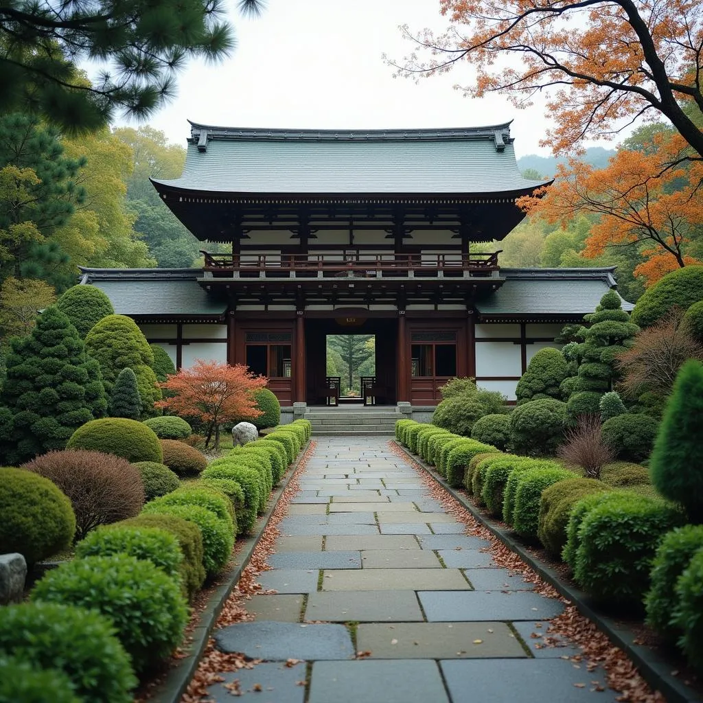
 Serene Japanese Garden with Traditional Temple
The foundation of any successful tour poster is a powerful image that instantly transports viewers to the heart of Japan. Opt for high-quality photographs that showcase iconic landmarks, breathtaking landscapes, or unique cultural experiences. Consider images of:
- Iconic Landmarks: Mount Fuji, Kiyomizu-dera Temple, Senso-ji Temple, Itsukushima Shrine
- Natural Beauty: Cherry blossoms in full bloom, bamboo forests, snow-capped mountains, serene lakes
- Cultural Experiences: Tea ceremony, geisha district, calligraphy class, traditional festivals
Remember to select images that are visually striking, evoke emotion, and align with the specific themes and destinations of your tour.
2. Typography: Finding the Perfect Harmony
The choice of font plays a crucial role in conveying the tone and message of your tour poster. Consider these typography tips:
- Elegance and Simplicity: Serif fonts like Playfair Display or Merriweather evoke a sense of classic elegance and sophistication, reflecting Japan’s rich cultural heritage.
- Modern and Minimalist: Sans-serif fonts such as Roboto or Open Sans offer a clean and contemporary aesthetic, aligning well with modern Japan.
- Japanese-Inspired Fonts: For a touch of authenticity, incorporate Japanese-inspired fonts like Noto Sans Japanese or Yu Gothic. However, use these sparingly for titles or accents to ensure readability.
Experiment with font pairings, sizes, and hierarchy to create a visually appealing and easy-to-read design.
3. Color Palette: Evoking Emotion and Atmosphere
The colors you choose can significantly impact the overall feel and message of your poster. Here are some color palettes to consider:
- Traditional Japan: Rich reds, deep blacks, and gold accents evoke a sense of history, tradition, and elegance.
- Natural Beauty: Earthy greens, calming blues, and soft pinks reflect Japan’s serene landscapes and natural wonders.
- Modern and Vibrant: Bold and vibrant colors like electric blue, neon pink, and bright yellow capture the energy and excitement of modern Japan.
Select a color palette that complements your chosen photography, evokes the desired emotions, and aligns with the overall theme of your tour.
Informational Clarity: Guiding Travelers to Essential Details
While aesthetics are crucial, your tour poster must also effectively communicate essential information to potential travelers.
4. Tour Highlights: Creating an Itinerary at a Glance
Use concise and compelling language to highlight the key attractions, experiences, and destinations included in your tour. Consider using bullet points or numbered lists to present this information in an easily digestible format.
Example:
- Explore the ancient temples of Kyoto
- Experience the bustling energy of Tokyo
- Relax in a traditional onsen (hot spring)
- Savor authentic Japanese cuisine
5. Call to Action: Inspiring Travelers to Book
Encourage viewers to take the next step by including a clear call to action. Provide a website address, phone number, or QR code for easy booking or further information.
Example:
Visit our website to book your adventure!
www.japantouradventures.com
Conclusion: Designing a Poster That Inspires
Crafting a compelling tour poster requires a thoughtful blend of artistry and information. By carefully considering your target audience, choosing captivating visuals, utilizing effective typography and color palettes, and providing clear and concise information, you can create a tour poster that not only showcases the beauty of Japan but also inspires travelers to embark on an unforgettable journey.
FAQs: Answering Common Questions
1. What are the standard dimensions for a tour poster?
Standard poster sizes include 11×17 inches, 18×24 inches, and 24×36 inches.
2. What software can I use to design my tour poster?
Popular design software options include Adobe Photoshop, Adobe Illustrator, Canva, and Affinity Designer.
3. Should I include pricing information on my tour poster?
While optional, you can provide a starting price range to give potential travelers an idea of the tour cost.
4. How can I ensure my tour poster stands out?
Use eye-catching visuals, bold typography, and a unique color palette to grab attention.
5. Where can I get inspiration for my tour poster design?
Explore travel magazines, websites, and social media platforms for design inspiration.
Need help planning your dream Japan Tour? Contact our team of travel experts!
Phone: 0373298888
Email: SEO.backlink@gmail.com
Address: 86 Cầu Giấy, Hà Nội.
We offer 24/7 customer support.